2009/03/03

BASE CHARACTER

texture_04-300x300 

(image from ART FROM CODE)

You need to be very alert/sensitive when you are seeking the art only belong to yourself - to find the unique but very nice character/effect of what you're doing. with necessary sharpening that effect that you want to achieve. Then, and then, you are free to go!

the character  inside the piece should be very pleasant, simple, whereas functional for most need - mainly means people will like it. like the drawing from code - complexly laid together in a sense of space but in a very simple structure and mechanical pattern.

2009/01/29

parametric design 的矛盾性(draft)

最近看见很多关于parametric design(以下简称pd)的中文讨论,mos的never enough被翻译和谈论很多遍。他这篇文章好的地方是,在别人都还没有闻到pd是什么味的时候,即已经把它狠狠批判,并且提到了一个超越它本身的地位-utopian。中间还有很多别的文章,比方说高岩(AA)在世界建筑上的介绍性文章(here or here)*,等等不一而足。

我想在这里谈的就是pd的工具性的本质,和超越它自身的可能性和必要性。

1228472172pd也好说白了就是一种工具性的思考方式的物质体现,核心理念就是高效性。这种对效率的追求被打包以后就是这样一群软件 -  输入关系后,可以轻松的加以调整。这中间就会出现“终于腾出手的”设计者的自由,去满足局部的需要。比方MOS的这个小剧场,结构限定好了之后这些小小的三角形就是自由的,你可以种草或是采光。  

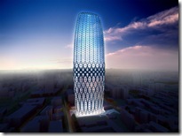
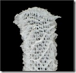
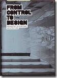
10974_2_dorobanti2big进一步说的话PD依赖的是系统论,一种可以自定义灵活度的系统。延伸下去有一种极端或是反例就是不再需要对细节关注,细节渐渐远离人的操控,因为细节属于系统和关系,这里当然也就是另一个问题 -  “渐渐脱离设计者的控制的局部”**。RUR在他们U1235P2DT20090115084801.jpg的书中就说,系统论不应该属于设计者,也不应该属于系统本身,应该在两者之间。主导性的还是设计者的艺术性。zaha这个楼是个例子,这些开孔或是倾斜的结构之间就超越了它们 自身的拓扑类型,并在中间自由的迁移:下部是结构,中部是开窗,上部又是结构。就要比MAD在天津的HONEYCONE TOWER要更POWERFUL,因为系统最大的困难就是在系统内部的变化不够多到能够响应更多的建筑局部的需求,做不到的话(或者)就陷入了无比的BORING的系统中。可见聪明的做法应该是对系统的灵活度加以最大的压榨,使其能够最大的满足功能。

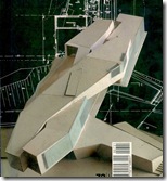
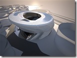
El_Croquis_72_I_ben_van_berkel_页面_01从短短的二十年之间就可以看见这种系统论对建筑的影响. 试看ben van berkel十几年前做的这个mobius house : 除了大的idea的支撑这个房子的核心以外,他还discretely(离散性的)加上了很多细节 ——我想在这里这样看这些细节——这种细节存在于对内部的功能的呼应,比方说最明显的那两个转角小窗,这是跟整个mobius idea是没有直接关系的,是一种简单的叠加关系,在我看来是失败的,是没有将mobius的idea真正、全面的转化成为建筑语言的一个瑕疵;反过来讲正是这种瑕疵才带给了建筑以人性的色彩,这是系统所不能一次给予的,或说现在的pd建筑还不能企及、还没有照顾到的层级化的architecturalization,而是仅仅停留在了大的zh2image 和 idea的自我陶醉上(单层级的建筑化)。我们从zaha的体育馆就看见了这一点:unibody+pd的组合完成了全部对建筑需要的全部考虑——入口,光线,遮阳。但是除了这个层级的建筑化之外就没有更多的内容了。其次是这个ubibody和U1235P2DT20090115084811.jpgperforming pieces是没有任何关联的。

PD在我看来是一种adaptive 的系统论的变种,应该有一种新的模式的存在使得pd超越以上讲的单层级的局限 - 在这种多层级的pd模式中,一个层面的参数的on or off是人来控制的,是人性的。

*颇小资的文字,我觉得高岩说的有一点是对的,大致就是东西方文化和思维方式的不同导致的审美、工作、逻辑上的不同。

**这个问题当然是属于巨量的操作对象所决定的。

2008/11/18

从建筑设计角度看几个常用软件(12.10.2008更新)

此文不断更新中,中国对国外新技术有兴趣的朋友请注意回访。

最近猛学了一阵软件,从rhinoscript到maya modeling&mel,还有若干3ds max的插件,有点想把自己对建筑设计领域里熟悉的几个工具软件总结一下 ,一方面也根据我自己在SOM的工作经验和在GSD学习的知识。(我在SOM工作有近一年半的时间里,主要在做一个孟买的机场项目,从最初的concept design到我们即将进行的construction document。)鉴于题目是关于设计的,这里主要讲造型的部分,对渲染部分暂不理会。

一般造型:rhino

准确

就建筑设计范围内,对于SOM这种生产型/应用型(对比开拓型)公司,最合适的仍然是rhino+cad/ revit,还要加上3ds max的渲染能力。主要原因是rhino跟cad的接口太好用,还有就是rhino本身就是一个半cad半cam接口的软件。它的这种定义范围决定了很多定位准确的功能,是那些animation软件完全不具备的。举例来说,按目标不等比例缩放以及几乎就是rhino一家独有,要想在cad做到这一点几乎是比登天还难(要做block)。3dsmax 和maya几乎就放弃这个功能 - 完全凭肉眼(其实也能做到,就是要用到新建grid的功能)。

成也nurbs,败也nurbs。rhino非常精准,基本上都是建立在对nurbs的高精度近似计算上,所以可以完美的和autocad衔接;计算准确也让他有非常强大的增加不同层次的信息,比方说project线就是非常快速的。但是它的坚定的单核心特点也是其对organic的形式来说构建起来十分麻烦,(我清楚地记得为了得到一个g3曲面差点熬夜,还有就是t-spline的出现让我有有一种rhino有很大的希望的假象)你要对每一个patch仔细的构建,确保和周围的连接patch保持平滑。

快速修改

在rhino里建模是非常方便的,你几乎可以找到任何的你想的到的方式去修改以个已经出现的模型,假如你觉得这个软件很不方便只能说你还没有找到那个特定的功能。实在不行,你也可以上手用scripting写个工具。(具体的应用可以看我公布的那些代码)。另外和autocad接近的快捷方式(命令行)简直就是人间尤物。

灵活的扩展

虽然相对于纯粹的cad软件精确度差了些,但是99%的情况下能够满足建筑行业的精确度要求。而高于cad的功能是灵活的层、组功能,以及简洁易学的scripting,再有就是庞大的外部插件,几乎满足造型领域的方方面面。

parametric

现在的grasshopper又引入了动态的、graphic式的编程能力,几乎就跟processing有一拼,尤其是最新的几个版本允许用户自定义自编的模块,简直是编程入门级用户的利器。(真不明白现在的小孩为什么对运动中的performance pieces怎么那么感兴趣,我觉得用的太shallow了)

sub-d

t-spline现在看起来虽然功能已经比原来的几个版本多出来很多,但是运行速度,还有稳定性都值得在等待一段时间。毕竟不是McNeel / Rhinolab自家的产品。

cellular behavior

paracloud的应用基本上就是paneling tool的高级版本,毫不夸张的说。真是有愧于它那$1000的价。不过对阳光数据的引用算是一大便捷,可是你要是对ecotect熟悉的话,你也可以结合scripting用这个方法

大量曲面:digital project+cad

对于保守型公司来说

像SOM, 我旁边的这个组就在用DP,不管男女老幼的样子。毕竟我没有真正长时间的用过,不敢瞎说。但是从我看见的这群人的工作来说,基本上设计是大概在两年前在rhino里完成的。现在的工作基本上是一群人在dp里添加信息,导出成cad图,或者切剖面,最后仍然要导到autocad变成最后的document.

DP特别适合在DD和CD阶段用。在学校我们都是学的很fancy的power copy什么的,在这里就完全当作是模型发展和生产工具(application level),半点没有辅助设计的作用。主要原因是这个建筑有着大量的曲面,另一个catia应该是业界最接近生产(manufacture)的软件,有着强大的物件管理和良好的cad接口,极其精准。但是我个人认为,修改起来非常麻烦。所以用它的大事务所就我所知都没有用在设计这个层面上,但是我看见工业设计师(vid1,vid2,vid3,vid4,vid5)用它从造型就开始了用catia了,不光是传统的nurbs(vid1,vid2,vid3),而且似乎它的sub-d能力也是很强的(vid1,vid2,vid3,vid4,vid5),而且也有类似maya中的partial crease,有点像滑动条的控制(maya proxy里的类似方式)方式。catia 对于工业设计者甚至有了从手工模型扫描,并且转到working model的插件,vid1

对于实验型公司来说

像zaha, gehry,还有一拨拨小公司来说,DP就是完美的从造型概念连续到最终的tooling的完美解决方案。最近面试了一家小公司,毕竟透露了人家的机密,名字就不讲了,他们的作品在最近一期的architectural record(2008.12)里,做的东西基本上就是zaha那套。他们没有任何fancy的软件other than catia and rhino。(顺便解释一下catia和dp的区别:catia是工业里的全包软件,dp是去掉了一些多余部分,对建筑进行了优化的结果,售价$25,000,比catia便宜太多了-下载到了破解的dp也没必要太高兴。)

基本的流程就是dp里用sub-d建大体快模,然后divide it into pieces,在within tolerance(这个值似乎是跟工厂的milling machine有关系)的情况下加上crease, fillet,似乎并没有像汽车工业一样十分在意曲面的连续性级别。最后直接把这个center piece(模具加工的芯)送到fabricator加工成品。对于建筑来说倒模比较麻烦,基本上面积都非常大,所以方法就是雕刻小块的模具再拼在一起铺fabric glass刷料,这里可以看见一个典型的操作过程。实际上构件的尺寸限制就是门的大小了,有点夸张。

我在面试的时候跟他们交流了几个rhinoscript和catia script的问题,实际上catia的script并没有一个非常强大的地步的主要问题是,这个脚本环境并不是被设计过而面向用户的,而只是一个软件的构架环境而已。具体问题就是在不同的核心之间没有很强的联系,甚至是不同的语言所写。你必须跳出一个workbench才能进入另一个,在转换的过程中,所有的联系都中断了。相比之下,maya mel在这方面太强了。

总之dp 或者catia有点像rhino和maya的综合体,长处是精准直接导出cad图,并且是从概念设计到fabrication的完整解决软件。


organic:maya+rhino+cad

此部分还在学习中....

maya就是半个parametric如果你愿意这么想的话,因为history的原因,如果你跟过reform的视频教程的话,其实3ds max也有这个能力。


ps:发现一篇文章,人成功是需要一万个小时磨练,颇受启发。

这篇有点奇怪的文章介绍了中国的CAM简史。

2008/10/07

some people on MIND08

http://mind08.com/  ,   http://seedmagazine.com/mind08

http://revminds.seedmagazine.com/

Bradley Samuels: Nature and Artifice


Seedmagazine.com MIND08

Skylar Tibbits & Marc Fornes: Partly Surface


Seedmagazine.com MIND08

Neri Oxman: Making Difference


Seedmagazine.com MIND08

Chris Lasch: Growing Space


Seedmagazine.com MIND08

Chuck Hoberman: Responsive Architecture


Seedmagazine.com MIND08

Kevin Slavin: What is Reality?


Seedmagazine.com MIND08

2008/08/23

technique, money and design

在跟整个机场的技术总监聊天,聊到一个非常重要的point,就是有时候工程的钱,建造地能获得的技术,以及建造的时间的risk程度,直接影响到设计的方向。

总的来说,设计者应该非常准确地把握到这个限制并转化成设计的“红线”,或者motif, 或者转变设计的风格。

举例来讲,我们的印度项目就不可能有contractor去投标做太复杂的skylight,因为没人能够做得出来,必须从美国加拿大ship成品,成本就没法控制;如果能做得出来,就要花很多时间,同样要赔钱。反过来说我们旁边的作中东的项目的group,因为太有钱了,就可以天花乱坠的三十个人作一堆Catia. 总不至于像我们的机场做到半腰开始瘦身开始警告不要过多overtime,curtain wall从corrugation变成平的结果什么也不是。

along the thought, 我们应该做什么样的回应?

之一可能要非常灵活的对应不同的语境作出不同的notion - 这是被动的一边。之一可能是对于语言和taste的见解应该更加富于理解力和宽泛/宽容,这是我们能更主动的一边。这里的态度不应该是见风使舵的,而是一种全面的和对智慧有更高要求的,以及坚持的。

显然我是比较futurism一些的,所以对于这一点的理解应该对我更有价值。但,终归结论是,早日回到中国回到真正施展磨练智慧的地方去。

2008/07/21

"sping 2007 gsd work"

credit: http://studioworks.gsd.harvard.edu/browse/studioworks.html
patrick hobgood Richie Yao
andrew witt
andrew bacon Hyong Kyun Rah
jia min nancy hou, johua de sousa Jaime Hernandez

Olive Cook
 

2008/07/12

"NERI OXMAN"


Rec-2008-07-10 17-37-12.mp3

blog:

MATERIALECOLOGY: Neri Oxman

neri oxman is focusing on computational design that is contributing on "form generation" based on  matter and material respects.

引用并翻译她的一段话:

"历史以来,建筑师作为"形式创造者"的概念一直统治着建筑这个领域。正是这种印象降低了一种有关材料的实践, 这种实践是一直存在于建筑话语所固有的"形式-材料"差异之中的。最新的计算机设计领域的技术发展,加上对环境因素的考虑、对哲学的讨论,已经导致了一种焦点的转移 - 从"形式" (作为一种在设计过程中与它物无关的物体)转向了"材料和物体本身"(作为一种获得"形式"概念不同的方法)。这种转变导致了现在设计者既有的语言的一次重新定位。基于PERFORMANCE(根据环境变化而做出响应)的设计的出现便开始激发了根据需要而做出调整的敏感的、计算的设计过程,这种设计过程整合了材料的属性,结构和环境的限制。这种设计过程加速了传统的建筑设计类型的消失,取以代之的是由"需要"和"舒适性"所驱动的空间组织。我们设想了一种新的设计方法,可以让“结构和环境制约因素”直接影响到可持续设计和解决方案中的“形式生成过程”。基于数据库的“形式生成”方法用在了发展和执行计算模型中,为了容纳材料的属性和行为特性我们还而特别定制了制造环节中所需要的工具和技术。"

full artical

2008/05/18

结构|装饰

这几天一直都在做这个机场的整个设计的motif - 柱子。 现在的状况是,设计已经定下来,如何开天窗。我们没有满足于仅仅是在既有的网格上简单的开口,因为这样将会忽略设计新的更好的系统的机会 - 也许会有更完善的系统能够carry所有的这些issue - 结构,panelization,装饰性(印度的要求-传统性/反现代性),天窗与common place的衔接。 这中间有些许心得。 结构其实是所有的核心,因为如果脱离结构的制约,将会获得极大的自由,但同时也失去了一种张力,失去了一个根基,这种关联性是我们所value的一个point.它的美感在完全挖掘出来的时候是非常powerful的,是一种终极的永恒的美感 - 无懈可击的。但反过来讲,这一点是如此的难以达到。。。。。这是真话,除非对系统有深入的理解,是不会有in depth的发现,这一点也是它迷人的地方 - 如此的珍贵,如此含有的才能得到的东西,必将是珍品。 当所有的人都在放弃这一点的时候,当所有的人都在跑步奔向所谓的elegent的时候,还有谁坚信这“深入”带来的power?还是enjoy视觉的candy?

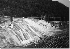
这张图片是一个绝好的例子。我们在amazed的同时也能看见这些pattern实际上来自结构vault的构件,一分不多一分不少的组成了dome的基础,其他一切都是在这个基础上的edge manipulation and surface articulation. we could even say, this is real beauty, because it goes with meaning tightly. your instinct and ming get happy at the same time.


而脱离了结构的那部分,将会沦为不实的系统,并被我的肉眼读为次等的快感。这一点从前一篇的三张设计中就能看见了,我还是喜欢第一张 - 如此的紧张又如此的自信。这种不实的系同如果泛化的话就是我们说的装饰 - 说白了,装饰性本质就是脱离结构的,或说image driven的。这也许有点不精确。


photo credit: Waheed M. Zuberi @ flickr
http://www.flickr.com/photos/waheedmz/2491559335/

2008/05/06

40 Bond Street


it's been a while that I went to the place. I remember this is the second HdeM project that I have seen.
This pattern is made up with metal stuff, I guess it is cast.
here you can see the whole idea is really about the pattern - here and there all the way in the view.
the language turns out to be serveral stuffs: casted patterned exterior door, perforated metal sheet(could be bent in a way to enclose function infrastructure), concrete screen print (as lobby floor), and milled ply wood.

2007/08/08

Understanding in Depth

I might not have time to polish the arguement, but...

A different and deep understanding can lead to an unusual art piece. In this sense, don't judge an idea using so called "common sense" or collective understanding - to be honest, you might not understand that idea at all, but, who knows that idea could ends up with miracal. Beacause, a different understanding is not equal to an bad one.

Mansilla and Tunon wrote in their introduction to the series of their work in the EL Croquis 136/137, Work System II, "The differentiated windows on the facade of the Leon Auditorium, framed in a canonical grid, were conceived as a random music score with a thousand eyes, striving to achieve the engraved depth of the random composition on the Hostal de San Marcos facede"..."Thus, the idea of history as a route (in Zamora), and the idea of time as a route (in the auditorium) magnetized the projects, carefully avoiding any literal reference to a specific formal context" . The Understanding here involves historical context response, formal driven thinking and the poetically weaven thoughts on architecture.

A thoughtful study leads to a better understanding.

A better understanding conveys a higher level of difference.

Sometime I am in shame of being a so fade mind people for long time.

Luckily, my love is a girl who owns much deeper understanding than me.

2006/11/29

Sou Fujimoto @ MIT

(on randomness)
Randomness is very important for me.
It goes with two side. One is the feeling of randon, one is that there is a straight rule controling everything, its own rule.
Randomness sometime is very precise.(for my last 'planning' project)
Before that (the random planning), I like to use straight rule, but after that I feel free. I started to have some new steps.
(On the forest diagram)
I can't use tree mode, because the structure of tree is already there, already perfect, just like an gothic architecture, that there is no space for me.(!!clear sense on himself) So I use the mode of forest, which is not like architecture. So I can translate it into architecture.
(on material)
I found material can make form more clear, for instance, you can paint white. And clear grogram, clear form would be rich by using good material. But I think form has its own material. So now I am persuiting. Maybe every material has its own form. I am not satisfied so far, cause material should not be put afterward, instead, it should be more precise.

2006/10/09

语言

片中导演杰尔西说「语言是用来解释语言的」。对高达来说,电影是导演所用的 语言,用来解释人类的语言,或是解释神的「话语」。既然找不到神,无法以神的方式 说明神的话语,便必须自己发明神,发明语言 ,来说明神的话语。同样的,电影的宗教 已经沦丧,电影的神隐藏在黑暗中,每一个电影导演都必须自己发明光线,发明自己的神自己的电影语言。

2006/09/25

kant's nature and sublime

这独立的自然美使我们发现自然的一种技术,这技术把自然对我们表象
为一个按照规律的体系,而这些规律的原则是在我们的整个悟性能力里不能见到的;这就是当我们运用判断力于诸现象时涉及一种合目的性,由于这个合目的性诸现象不仅仅隶属那在它的无目的性的机械主义中的自然,而是同时必须判定为隶属于类似艺术的东西。这自然美固然不曾真正地扩大我们对于自然对象的知识,但是仍然扩大了我们对自然的概念,这就是从自然作为单纯的机械性扩大到自然作为艺术的概念。而这就导引我们深入地研究这样一种形式的可能性。但是我们在自然中所通常称为崇高的现象里,却不具有任何东西导引我们到任何种特殊的客观原理和符合这原理的自然界的形式。它们(按指自然里的崇高现象)却更多地是在它们的大混乱或极狂野、极不规则的无秩序和荒芜里激引起崇高的观念,只要它们同时让我们见到伟大和力量。从这里可以看出,自然界的崇高概念比起它里面的美的概念远远不那么重要和有丰富的引申;而它根本不指示出自然本身里的任何合目的性,而只是在自然直观的可能运用中在我们内心里激起完全不系属于自然界的合目的性的感。关于自然界的美我们必须在我们以外去寻找一个根据,关于崇高只须在我们内部和思想的样式里,这种思想样式把崇高性带进自然的表象里去。这是很必须预先加以注意的一点。崇高的观念要和自然界的合目的性完全分开。关于崇高的理论只应成为对自然界的合目的性的审美评判的一个附录。因为通过它不曾表象出自然里任何特殊的形式,而只从自然的表象发展着想象力的一个合目的性的运用而已。

2006/09/20

relationship, simplicity and complexity

These days just kept thinking about relationship, between things, which provides us a sense of beauty pleasure or something - somehow about the core of beauty - baout our perception.
 
Inspired by the Algorithmic Architecture, which not only provides tech but also phylosophy of tools, say, there is a relation between things, namely, even thought a bundle of complex things show our as a simple appearence. This idiom comes from Taoism.
 
Thinking about it and feel that could be divided by two in architecture. Some people dealwith super complicated relation or in-world with simple elements (higly developed); somepeople use super complex elements to build up a simple overall "one". Which I think can be seen as the division of westerner and eastener. Japanese, spain, something like that.
 
Masilla Tunon's systemization -from a little simple unit or element to asystem of complexity
 
 y1pn20vUICRsqoh5vYV8VwKj-OT3ABoBGpd5H3gVNLzwzRduW1ALhF9dzrt2UNmWhgkMUPa1aw6ceoS5uDkq9v-cg
 
Japanese Sword - big simple image & detail comes from crafts(from METAPOLITAN NYC)
 
  y1pyIFBBV_UgIBVZEliMCSClddHbkgbMUrLnGEy3VKvhcQ0a6Dj8pIRW6eoxtU9RQjbPi1E2h4lN9Cq7auovhYLWQ
 
Japanese Sejima Building in Geerany - simple image and idea & complex experience inside outside upside (from ARURE)
  y1pUBxzJgKc0athdnAR0TarCmqJFCDEfECAneHi0m7KrE38vWajUE04ODOpfitTMHQTSS_aWO2SJ8HfYlMu7ydItg
 
GSD Grape Studo, author ...(Japanese, Kei Takeuchi) - like the sword(from GSD Exhibitin Wall,2005-2006 Studio)
 
 y1pmopVJKyM9FAnJx8gW6jJaacTjCdiWhTKMQCUVoyh4wP4qQJntc2ADmqqTgJxxn_2j5RSgpZ5bRo9yFiS-yVfIg
 
 
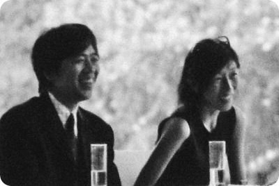
BTW, i like this portait foto of them. they look likely and match....(from ARURE)
 

y1piOnQqXuHHZC8prmFWG9p-U86GoI0CuDWNi1rrPsKQxmYIUi6ThBFYnHHs1ZzIp_JB3LGuN8yn_0J9CckfS4V0w

2006/09/18

deM Studio Meeting @ GSD

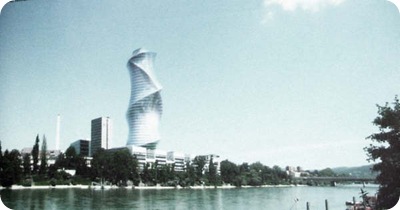
keyword: metabasel, tri-nation, historically, centrally located swiss
 
Pierrer de Meuron look very nice in his show with the assistant. He was kind of showing off in front of the students who were not so attracted by the thesis topic. I was just surfing the presentation bu more enjoying the master's way to talk, think and debate - it's my first meeting with them.
 
But I am quite interested by the topic. It was not so "unban", I mean a traditional way. As he said - try to find the possibility of new method, which in a way I'd like very much. Maybe it is on my own personality - never care about other theory before - even though obviously they know it very well.
 
His thinking was very pratical and easily to understand. He looks up the ability dealing with "shape" a lot. On another hand he value the ability of analysis and rationality as well, even though as archtect we couldn't deny or get rid of the formal thinking.
 
He value the true and earthy feeling of living, such as forest in the city or city in the forest, sport around a like would be nice experience for a urban life, which was the same argue as before.
 
The basel skyscraper will be built in months.
 
lots of stuff can be found in their studio introduction - "Switzerland An Urban Portait"
 
His appearence was suprisingly shown as CK style black top(short can see belly), jean, puma, and suit top, very neat and young. (which was like the stuffs in my cabnet.)

y1pVTpJy-pMTyh8Xi4WdZrdBSK2eYRdz76SNkPwqI0tWrKC7LF816EpPzFlD1L0W0jiOsSeWSD9lrPKJzsHPPKpXQ

2006/09/14

最后

建筑师有别于别者,除了把自己变成一个建筑为媒的精确敏锐于感觉世界的艺术家外别无他法(有别于规划师,技术者,评论家。。。)

建筑有别于其他媒体的最后堡垒只剩下“在场体验”(有别于电影,摄影,绘画,雕刻。。。)

2006/09/13

Ito new building


Appreiciate his keen proportion between an "architectual idea" and his desire - no to much, but clean.

image of architecture in electronic age

 from http://www.designboom.com/eng/interview/ito_statement.html
- toyo ito


Architecture in Electronic Age is Figuration of Vortex of Information
From the primitive age. the human body has been linked with nature as a member in which water and air circulate. People today are equipped with an electronic body in which information circulates, and are thus linked to the world through network of information by means of this other body.
This virtual body of electron flow is drastically changing the mode of communication in family and community, while the primitive body in which water and air flow still craves for beautiful light and wind.
The biggest challenge for us is how we can integrate these two types of body. The same applies just as well to architecture today. Our architecture has traditionally been linked with nature through figuration of movements of vortices occurring in water and air. With contemporary architecture, we must link ourselves with the electronic environment through figuration of information vortices. The question is how we can integrate the primitive space linked with nature and the virtual space which is linked with the world through electron network. Space which integrates these two types of body will probably be envisaged as an electronic biomorphic one. For, just as the figure of a living body represents the loci of movements of air and water, the virtual space will most likely be figured as the loci of human activities in the electron flow.
Architecture in Electronic Age is an Extended Form of Media Suit
IIn 1960s, M. McLuhan said that our clothing and shelter are the extended form of our skin. From old times, architecture has served as a means to adjust ourselves to the natural environment. The contemporary architecture needs to function, in addition, as a means to adjust ourselves to the information environment. It  must function as the extended form of skin in relation both to nature and information at once. Architecture today must be a media suite.
People, when clad in a mechanical suit called automobile, had their physical body expanded. People clad in a media suite have their brain expanded. Architx1pk64-9H0OKxR3zT075CpNRrWYVt9zvvS8-VBrmEKUrJSPBfPZ-7Y-P8G-BGK9-5_md-SaReeGqttv3nWEOQwAwKHmg00BHJIsZOZyflH50m07hofQRsNYNzr_OUiyec31p9FYLg3im4HpOORnRzFLA3tTSjYtTlm4ecture as media suit is the externalized brain. In the whirlpool of voluminous information, people freely browse through information, control the outside world and appeal themselves to the outside world. Instead of appealing to the outside world by armouring themselves with a hard shell-like suit, people do so by wearing a light and pliant media suit which is the figuration of information vortex.
People clad in such media suit are the tarzans in the media forest .
Architecture in Electronic Age is a Media Convenience Store
The curtain has been fallen for an age when museums, libraries and theaters proudly showed off their archetypal presence. Paintings on the wall and books in paper are no longer an absolute existence. They are turned into something relative by the electronic media.
Media with established styles such as paintings, books and movies will in future be ranked parallel, free of hierarchy, with electronic media such as CDs, CD-ROMs and video tapes. People will use x1pk64-9H0OKxR3zT075CpNRrWYVt9zvvS8-VBrmEKUrJQdFuPEKzM30cN5OpazUoWFiMKCL7VU8Oj52DDcAGzwC4nmuAMV_t3Oc1hewoyu-4ijKFoPMPtfCB_h2N-mPOrAx8wEEhSUq81muFHxU88DXiuu5bP1HQnW both types of media in mixture and in a complementary manner.
Enjoying paintings and books through electronic media will surely demolish the once established form of archetypal museums and libraries. They will all be fused into one and there will be no boundaries between a museum, an art gallery, a library or a theater . They must be reconstructed as a mediatheque. It will be a convenience store of media where a variety of media are arranged in arrays. and a convenience store of culture which offers different cultural functions.
This new form of convenience-store-like public building should not be a symbolic presence across a public plaza, rather. it should be located near a railway station and be open until midnight to serve the public in their daily life.
Architecture in Electronic Age Changes the Concept of Barrier
Various types of barrier in today's society define the form of architecture. It is not merely the barrier between healthy and elderly or handicapped people. A great barrier exists between the administrator of a building and its users, between private and public spaces, between archetypes in different genres such as library and museum, between one's mother tongue and a foreign language, and between different media such as visual images and printings.
Development of electronic media may invalidate these barriers one after another. Introduction of personal computers is now radically changing our mode of communication. The educational and social systems which are rigidly restricted by the traditional media such as printed matters and paintings will also confront the need for drastic reform. In future, distinction between different physical senses such as vision, hearing, smelling, taste or touch may become meaningless as the development of electronic media may enable signals to be input directly in the brain or the nervous system without relying on such organs as the eyes, the ears or the nose.
The advent of automobile navigation system has changed the concept of a map. Drivers are constantly informed of their location and are guided to their destination by communication satellite. They do not look up in the map but are immersed in the virtual space called a map. Such a navigation system can also be employed to guide people in urban or architectural spaces.
Architecture in the electronic age will probably radically change our concepts such as of healthy people versus handicapped people, administrator versus users, or public versus private spaces .
Architecture in Electronic Age is Architecture That Designs Time
Process of design will change by the introduction of computers. It does not simply mean that plans drawn on tracing papers with pencils are replaced with images displayed on computer screen. We can erect a virtual building and experience it in the designing process. We later experience another building as a physical existence. The process of shifting from virtual architecture to physical one is continuous. These two types of architecture overlap each other and proceed simultaneously.
Eventually, the physical building will emerge. By that time, however, there will be still another virtual space created by the introduction of electronic media. Even after the physical building is completed, its architectural programs may continue to undergo modifications as new media evolve. Thus there will be no end to our spatial experiences as the real and virtual spaces overlap in our experience. Design in architecture will refer not only to traditional hardware design but also to a more flexible software design that includes programs. We will be designing the time just as we design the space.
Program and Concept
Sendai Mediatheque embodies our proposal for a completely new concept of architecture. The project started with an open competition held by Sendai City, and its basic design and working drawings have been completed. The complex includes Mediatheque, an art gallery, a library, an information service center for people with visual and hearing impairments and a visual image media center. During the open competition and subsequent phase of basic designing, our primary effort was on demolishing the archetypal ideas of an art museum or library to reconstruct a new idea of architecture called "mediatheque" utilizing the state-of-the-art media. This process of reconstructing the architectural concepts not only extended to hardware but to software as well.
To this end, repeated public hearings and discussions were held inviting experts from different circles during the basic design phase.
Our proposal has always been prototypic and conceptual rather than formalistic from the very beginning. It consists of three elements of "plate", "tube" and "skin". By "Plate" we mean six square slabs, and we attempted to diagramatically express different modes of communication between people and things that may vary depending on the media used . " Tubes " are 13 tree-like elements that vertically penetrate the plates to organize and integrate the latter. They are the flexible structural members acting also as the vertical traffic line and as the space where energies (light, air, water, sound, etc.) and information flow. Presence of the tubes creates movements of natural elements and of electrons in the homogeneous spaces defined by the plates. Although by "skin" we mean the elements that separate the inside of the building from the outside. it particularly refers to the skin that surrounds the machine spaces located at the top and the bottom of the building and the double-skinned facade facing the main street.
With its three simple component elements, the mediatheque will offer a space where a body of electron flow and a primitive physical body which is linked with nature are integrated.
Structural System
This minimal and pure form of structure consisting simply of plates (flat slabs) and tubes (shafts) that define the building is our version of steel-framed Dom-ino system. Steel honeycomb slab structure (400mm depth; 1,000m grid span) and light-weight concrete (70mm thick) are combined to make a steel sandwich panel (50m?`50m) . Use of thick-walled slender steel pipes (120?`240ƒÓ/t-10?`30mm) as single-layer truss structure realizes a highly transparent and tough main structure while assuring structural integrity and rigidity.
Our new proposal for aseismic design is the use of energy absorbing mechanism in the underground structure (basement 1F) which is expected to be as effective as the traditional aseismic structure. By structurally disconnecting the bottom, underground space from the upper space (main structure consisting of the tubes) in a flexible manner, earthquake energy exerted on the building can be absorbed by the bottom structure. alleviating the impact imposed on the upper part of the building. A hydraulic jack will do for repair even for damages caused by a great earthquake that may occur once every several hundreds of years.
Air-Conditioning System
The system may be compared to the biological activities of a tree. Machine spaces for air -conditioning system are located on the rooftop and the bottom floor (basement 2F) and are communicated with each other by the tubes penetrating the plates. Just as various elements produced by Photo-synthesis and the nuturients absorbed by the roots from the soil flow inside the trunk of a plant. various forms of energy Produced in the machine spaces at the top and the bottom flow inside the tubes. Air flowing in the tubes is gently and slowly discharged into each of the free-access floor spaces via the air inlet duct
provided near the floor surface. with the dual-floor structure acting as the plenum. This system gives the feeling of coziness to otherwise , vast expanse of the spaces created by the floor plates .
The double-skinned facade on the south facing the main street breathes like the human skin. During summer, the upper and lower opening mechanisms are released to generate ascending air current inside the double-skinned wall to cool the wall surface temperature to thereby reduce the need for forced air conditioning. During winter, the opening mechanisms are closed so that the double-skinned wall can function as a highly insulating layer of air. thus reducing the heating needs.
These mechanical technologies are combined and integrated at different levels to make the building as a whole an organic and functional structure.
Natural Lighting system
The tube also acts as an effective device to introduce natural light into the building. Natural light is effectively taken into the building by means of an optical mechanism (light intake) provided on the rooftop, transmitted in the downward direction by the optical reflection sheet (light extractor) provided inside the tube, and diffused into the inside spaces on each of the floor by means of prisms and lenses (light outlet) . Artificial lighting means are also arranged inside the tube.
The color temperatures of natural and artificial lights are mixed to adjust the brightness. During the day, an environment is created where the abundant natural light and man-made light coexist. These devices are promising as the first step toward positive utilization of natural light.

2006/09/11

Webnote – Nature History

for over 20 years Herzog & de Meuron (H&M) have been luring their public into discussions as to whether their projects are about art or arch.. 

for while the rest of the world is grappling with the art-or-arch. question, they are free to work away at their next coup

Since the 1980s they have been showing how the outer skins of buildings, independently of the underlying structures, can function as images or, to quote H, can be "positively saturated" with images. 

They number their projects,  in the manner of Paul Klee or Gerhard Richter. Many of their clients come from the art wiorld...moreover , between 1979 and 1986, when their firm had few commissions, H successfully pursued a parallel career as an artist.               

but.."it is impossible to do art and arch. at the samhttp://www.thecityreview.com/s01scon1.htmle time,"... there was no longer any need to express himself other than in architectual terms. For H&M the practice of applying the notion of art to arch. is simply absurd.    (in our view, the proximity between the work of art and the work of arch/ is justified, bu i think that to apply the image of art to arch/ is the worst thing you could do, and this is just what is happening more and http://www.lawrence.edu/dept/art/arthistory/faculty/klee.htmlmore frequently : for ex. the images of minimal art, of deconstructivism, or of high-tech are being applied to architectonic and urban design concepts which date either from the last century, or from the glorious days of the CIAM.) 

Indeed , they state very explicitly that their arch. is not art and that in any case they are in favor of the autonomy of different genres:   arch/ has to do w/ a great many things, it has many aspect, and certainly there is arch/ that comes close to the visual arts, because it has that speciific character... today everyone is thrown back on their own resources and has to define their fundamental values anew each day. as a starting point that is not unlike the visual arts. but one cannot therefore say that arch/ is art. 

(this is really funny:)                     Basel, an "in-between" city (Rem Koohaas), is a centre for the chemical industry and pharmaceutiacals. could that be a source of the their interist in change and alienation as well as in sunthesizing disparate features that otherwise seem irreconcilable?

(but this seems an understanding making sense, could be generated from their scientific environment:)                     western culture "is a culture of blending and mixing substances until they are unrecognizable. these substances are a part of that matter which, according to a basic law of physics, is never lost. however, in innumerable products of our industrial age, these substances, this matter, can only reenter a natural cycle with great difficulty. this means that after they are scrapped, they harden into a useless degenerated state in a dump or depot." in architectures of H&M 

"the impossibility of keeping tradition alive is a universal and irreversible phenomenon."  architectures of H&M


yes, i know i am ghetto, but finally i found who he is,, the guy who always shows in Mansilla + Tunon's rendering. He is Joseph Beuys, a great artist in late 70s. I am happy to got that.---------"And for H&N, as for many others born around 1950, Beuy - who turned everything he touched into art - was the artistic father figure who embodied the rebirth of European culture. He sublimated what was a deep source of trauma to many , that the autonomy of German culture - already compromised at the outbreak of the 2nd World War - was once again threatened with the Americanization that came with the implementation of the Marshall plan"


Minimal Art was appropriated by architecture in the 1980s as a formal paradigm... 

"Donald Judd 's sculpture inspired Zaugg to produce his book The Guile( 诡计) of Innocence.-------H&M have a high opinon of the book in part because of Zaugg's deliberation on the perception and function of exhibiting." ...as the juxtaposition (并置) of Judd and Warhole's works


about Donald Judd:                  

H&M do, it is true, admire the "unbelivable beauty" of Judd's sculpture - admiring the look, that is to say, the finish of the surfaces, the choice of special techiques and materials as well as Judd's fasination with first-rate craft skills. Yet at the same time they do not want to be categorized as producing minimalist architecture, however that may be understood. "Abstraction and reduction are absolutelu not our theme"... "Judd created a homogeneous universe - an old, totalitarian notion: he thought his sculpture had a broad validity and that art could offer universal solutions. A naive thought. Bauhaus is a thing of the past"    !


 about exhibition:                     

They stress that for them exhibitions of architecture are like test run. Their point is neither to document finished projects nor to provide an insight into the architects' creative processes. And it is also not a matter of designing exhibition architecture as either a forn of installation or a formal ambiance. It is purely and simply about the genre of architecture exhibitions. As they themselves say:  " We are not out to fill the exhibition space in the usual manner and to adorn it with records of our architectonic work. Exhibitions of that kind just bore us, since their didactic value would be conveying false information regarding our architecture. People imagine that they can follow the process, from the sketch to the final, photographed work, but in reality nothing has really been understood, all that has happened is that records of an architectural reality have been added together"


 Architecture: A Way of Thinking


When you have no idea, just feel it--weiss 

It is not a good age to study, it is the age to do with yourself, to expose your ego--weiss  


What one could perhaps call philosphy, is an edifice constructed from thoughts, texts, and images. Our architecture helps us to perceive that edifice, one piece at a time----Herzog (人们也许会称哲学是一个由思想、文本和图景构成的宏伟大厦,而我们的建筑帮助我们一次认识一座这样的大厦) 

Alpine Farmhouse


space and Henri Lefebvre

Henri Lefebvre1

Henri Lefebvre2

interview

西方学界关于列斐伏尔思想研究现状综述(philosophy.cass.cn,刘怀玉(南京大学哲学系))

昂利·列斐伏尔(Henri Lefebvre,1901~1991),一位和20世纪一同降生的现代法国思想大 师 ,在其六十多年的创作生涯中,为后人留下了六十多部著作、三百余篇论文这样一笔丰厚的 精神遗产,是西方学界公认的“日常生活批判理论之父”,“现代法国辩证法之父” ,区域社会学、特别是城市社会学理论的重要奠基人。

值得一提的是,在列斐伏尔的重要著作《日常生活批判》第1卷于1991 年被首次英译刊出之后,其后两卷的英译本可望于2003年前后问世。这是继《 日常生活批判》三大卷的德语与日语译本之后的第三种外文译本。

一关于列斐伏尔的日常生活批判理论的评价

1.关于列斐伏尔的日常生活批判理论的来源与早期形态研究的评述

...

...

布克哈德认为,列斐伏尔日常生活批判理论的形成,就其现实原因来 说,始于对法西斯主义的批判。列斐伏尔认为欧洲革命的失败与法西斯主义的兴起,一个重 要原因就是日常生活意识的神秘化,特别是个人主义意识与民族主义意识这两种意识形态神 秘化。这一点与法兰克福学派的观点与经历有相似之处。但后来列斐伏尔将重点转向对大众 消费社会的研究,而不同于阿多诺等人陷于对法西斯主义的哲学美学批判中不能自拔。早期 列斐伏尔的日常生活批判是和同时代的葛兰西的意识形态霸权理论、卢卡奇的物化与阶级意 识批判理论、阿多诺的启蒙辩证法与文化工业理论等联系在一起的。而到了后期,他的“消 费 引导性官僚社会”理论则与马尔库塞的单向度社会理论、福柯的惩罚社会理论等联系在一起 的。...

2.关于列斐伏尔的日常生活概念的内涵与特征的研究

列斐伏尔日常生活批判理论的独特性是与其核心概念“日常生活”的丰富内涵联系在一起的 。谢尔兹发现,列斐伏尔是根据20世纪之初的超现实主义来把握“日常生活”、“日 常”(le quotidien)的概念。日常是一个反映资本主义条件下的陈腐的、琐碎的与枯燥重复 的生活品质的概念。“日常”(the everyday)与“日常性”(the everydayness)不能简单地 等同于“日常生活”(everyday life)或“每日生活”(daily life)。 后者通常是指那些不好分类的、习惯性的、常规性的一天又一天的生活的本性,而不是用于 批判性地特指的每天生活中的异化、干巴的“日复一日性”特征。借安东尼·吉登斯(Antho ny Giddens)的话来说,一个是现代社会的单调乏味的机器般的有节奏的日常生活(ev eryday life),另一个是古代社会的充满着具体而丰富的意味的每日生活(daily life)。

谢尔兹指出,在列斐伏尔的著作中,日常生活是指一种单调乏味毫无意义的生活,而不是指 每天的平常生活。这一点与赫勒倾向于将日常生活理解为一种本体论意义上的“本真 ”状态的立场明显不同。列斐伏尔突出的是日常生活的本真性的缺失与异化四处弥漫占支配 地位的特征。日常生活因此并不是一个创造性的自我实现的活动过程;它同时又是 一个充满奇异冒险色彩的世界,一个克服或扬弃矛盾的过程。

3.关于列斐伏尔早、中期日常生活批判理论的联系与区别问题的研究

...

...日常生活仅仅是沉闷单调的每天生活现实,它终究要被一种 革命的、非异化的社会生活所取代。经过近40年后,在他的系列著作《日常生活批判》中 ,日常生活又呈现为一种抵抗与更新社会生活的基础,可以作为神秘的灵机(瞬间)与非异化 的在场来揭示——就像阳光穿透层层云雾:日常生活的单调乏味如同层层乌云,而瞬间的在 场则似耀眼夺目的灿烂阳光。瞬间是日常生活的一种拯救:“日常生活=单调性÷在场的瞬 间”。...

...而《现代世界中的日常生活》则认为,在现代社会初期,日常生活还是一个 被忽略的、因而放任自流的边缘化领域,而在发达资本主义社会,现代日常生活则被全面地 组织到、纳入到生产与消费的总体环节中去。日常生活成了资本主义统治与竞争的主战场, 而不再是被遗忘的角落。现代社会成了一个“受控消费的官僚社会” ,而不是一个可供人们自由选择的休闲社会、丰裕社会 。在现代世界中,日常生活被技术理性、市场交换所入侵,被传播媒体的符码化统治体制多 重性地殖民主义化了。正像马克思所指出的,资本主义社会是一个交换价值超越、脱离使用 价值的社会,一个为生产而生产而不是为日常生活而生产的社会,这就导致了资本主义社会 中生活意义消失、现实参考系统消失的异化现象。...前工业社会中所常出现的人们对自然统治、对暴力统治的直接恐惧不见了, 但人们今天则生活在一个你根本无法逃脱的符号化、体制化、抽象化、匿名化、功能化统治 时代,一个不再有具体恐惧、因而是恐怖普遍化的时代。正因为如此,列斐伏尔才始终坚持 ,今天的社会解放一定是总体性的而不是某个领域的(如经济的或政治的、文化的),一定是 日常生活的节日化、艺术化与瞬间化。


...目前法国学界侧重于从城市社会学角度来接受列斐伏 尔,而英语国家则倾向从空间理论、地理学理论与后现代主义方面来接受列斐伏尔。也就 是说,法语学界认为列斐伏尔的主要著作是《城市的权力》一书。而英语学界认为列 斐伏尔的主要著作是《空间的生产》一书。...列斐伏尔在《城市的权力》等著作中的一个重要贡献是明确区分了工业化与 城市化,突出了城市化与重建现代日常生活的重要意义。在列斐伏尔看来,城市化与工业化 并不是同质的、而是矛盾的双重的过程。工业化最初是以破坏城市化为前提的。工业化是增 长的、经济的过程,而城市化则是发展的与生活化的过程,因此不能用工业化代替城市化。 列斐伏尔研究城市的日常生活,目的是要瓦解传统的理性主义或者柏拉图式的哲学理想国对 城市生活的同质化设计与控制,重建一种差异性的空间乌托邦。

与考夫曼和列巴斯的倾向有所不同,谢尔兹认为,列斐伏尔对马克思主义最大的贡献 也许是不断地运用辩证唯物主义方法研究现代日常生活问题,但他目前对西方思想界影响最 大的方面却是对“社会空间”的发现。“列斐伏尔不断地将自己的最初的日常生活概念译解 为一个空间与城市领域内的范畴。”列斐伏尔最重要的贡献是将辩证唯物主义基础从时间移 向 空间。

美国著名的左派地理学家戴维·哈维在《空间的生产》一书英译本后记(列斐伏尔,1 991b)中指出:通过1968年的历史事件,列斐伏尔认识到了城市日常生活状况的重要意义— —它是革命激情与政治的核心。这种看法与传统马克思主义只关心工作场所的政治问题的狭 隘视野是对立的。对于列斐伏尔来说,空间不是通常的几何学与传统地理学的概念,而是一 个社会关系的重组与社会秩序实践性的建构过程;不是一个同质性的抽象逻辑结构,也不是 既 定的先验的资本的统治秩序,而是一个动态的矛盾的异质性实践过程。空间性不仅是被生产 出来的结果而且是再生产者。马克思仅仅看到一定空间与时间制约下的物质生产,而没有看 到,资本主义的“生产”更是一个不断地超越地理空间限制而实现空间的“自我生产”过 程。

列斐伏尔非常重要的一个贡献是提出“空间生产的历史方式”。借鉴马克思的生产方式 理论与社会形态理论,他将迄今为止的空间化历史过程理解为如下几个阶段:一、绝对的空 间——自然状态;二、神圣的空间——埃及式的神庙与暴君统治的国家;三、历史性空间: 政治国家、希腊式的城邦,罗马帝国;四、抽象空间:资本主义,财产的政治经济空间;五 、矛盾性空间:当代全球化资本主义与地方化意义的对立;六、差异性空间:重估差异性的 与生活经验的未来空间。

" 

"The theory we need... might well be called, by analogy, a 'unitary theory'(一元论): the aim is to discover or construct a theoretical unity between 'field' which are apprehended separately....The project I am outlining, however, does not aim to produce a (or the) discourse on space, but rather to expose the actual production of space by bringing the various kinds of space and the modalities of their genesis together within a single theory." ----Henri Lefebvre, The production of space,


Space\Transparency\Opacity in HdeM

"everything can be viewed from every aspect, ...At the interface between individual building and urban space, they condense the abstract space into a sustance by means of images and carefully selected materials. This substance then knits together the "mental" and the "social" space indicated by Lefebvre.


At the interface between individual building and urban space, they condense the abstract space into a sustance by means of images and carefully selected materials. This substance then knits together the "mental" and the "social" space indicated by Lefebvre. In doing so, Herzog &de Meuron are able to to realize something that Lefebvre could only speculate about, namely the oneness of monument and building.

(How could the contradiction between building and monument be overcome and surpassed? How might that tendency be accelerated which has destoryed monumentality but which could well reinstitue it, within the sphere of buildings itself, by restoring the old unity at a higher level? So long as no dialectical(辩证的) transcendence(卓越) occurs, we can only expect the stagnation(停滞) of crude interactions and intermixtures between 'moments' - in short, a continuing spatial chaos.---Lefebvre)

But they question the spatial continuum and what Lefebvre criticized as an "illusion of transparency and opacity"


Rafeal Moneo praises the Dominus Winery as "exaltation and celebration" of the material itself, a material that needs no form.
But it is precisely the celebration of materials for their own sake that makes for one of the qualities of the spatial logic of the spectacle. HdeM's experiments have precisely the opposite goal: to create forms that make the material speak.


spectacle culture(visualization culture need)


HdeM are constantly trying our different registers of exhibiting :

  • the architectural exhibition as a genre in which architecture is mediated to an interested public;
  • the exhibition of architecture itself , as a means for the presentation of object;
  • the question of exhibiting their buildings in mental and social spaces.

their alternative to the representational system of the spectacle is therefore not about anti- or non-capitalist representation, but rather a form of representation that can cope with the complexity and dynamism of the current situation and is thus , by definition, oriented to the future. - there has been an increasing demand for architects who, to put it bluntly, have more than just showcases and white cubes at their command. It is hardly surprising that both Prada and Tate turned to HdeM


building site - built or unbuilt:

John Soane(1753-1837) solved the problem of representing a finished project by depicting buildings as ruins.

Robert Smithson once spoke of construction sites as "ruins in reverse"

Fotos of the constructiion site use fragments to evoke a whole that is otherwise impossible to depict adequately, thereby meeting the architects' interest in the "whole" of architecture. - "The reality of architecture is not built architecture: an architecture creates its own reality outside the state of built or unbuilt and is comparable to the autonomous reality of a painting and a sculpture."


 The Death of Photography

Once again our main concern is the question : what is reality? How does a specific, depicted reality relate to time? I personally have a rather strange relationship to photography. It fascinates me but it depresses me, too, because it is so intensely related to the past, to the passing of time, to death. Especially when it refers to your own life, to the decay of your own body, with which you're confronted when you look at family photo albums, for example.
Everybody has had that experience but people respond in different ways. My brother is obsessed with collecting old photographs. His collection makes one acutely aware that the incredible accumulation of documents over the past 150 years of photo history presents a record of inexorable decline: people , buildings, nature, mountains,glaciers - they all change and ultimately even vanish. That is traumatic. Only photography can express this aspect of the human  condition with such poignant urgent.


We liked the idea that we had to introduce a technical grain in addition to the natural grain of the concrete, which presupposed the fuzziness and disappearance of the picture. It is this effect that interests us in the work of Warhol, whose repetitive silkscreens are not identical though they look like stamped prints. So on the one hand they demonstrate the technical aspect but on the other, change and transience. Actually it is the objectivity and incontestablity of photography and its inescapable closeness to death that at the same time both fascinates and repels me.
2006/09/10

Some notes at a GSD meeting

This was from a senior architect at HdeM.

We talked a lot about the firm and the way that they develop a scheme, which is a way with a lot of collaborations.

  • They care about copyright things a lot.
  • H is more like a child and doesn't have big reputation inside the firm, instead, de Meuron is more strong (at the end) and talented, even though he is less talkative than H and put behind H.
  • They never talk about Rossi, they mentor, coz' they don't wanna talk about architects a lot, more willing to talk with artists -  like AiWeiWei in China -  they'r gonna ask more questions and suggestions from Ai, like what do you think about the color?
  • there are always people fight with them when talking about idea or running in the critic... and then always have people get fired by deM.
  • Hnever know who are coming in and who are leaving from the firm. All the house keeping's are held by Pierre.
  • Both of them are nobles background.
  • Never kid with Pierre. He is the real boss. H and so on's signature value nothing.
  • 3yrs senior=70k
  • H has a 16 yrs old girl. His first contact with his wife was in a bar when he fighted with his future wife, 30 yrs ago.
  • H has a HUGE personality. When he was in ETH, he said, you guys always talk about Corbusier. I will be the topic of you guys in 20 years.
  • The only thing they care about is producing, the quality of producing.
  • They broach ideas in a analysis way, always.
  • the images just a way to provide a subject (a story) that allow people to feel, to think.
  • They don't care about quality, or put it another way, they don't care how many mistakes are running on the site, if the idea is so strong and unique enough.

2006/09/07

巩俐

巩俐:我看了《无极》。我觉得就像刚才说的那样,这是一个尝试,陈凯歌没有拍过那样的戏,之前他的戏都是很严肃的,他想尝试一个不同的方向,他当然可以去尝试,无所谓失败和成功。之后会发觉我可能不适合,但在成功或失败中都可以学到很多东西,我相信他自己静下心来看自己片子的时候,会知道什么地方是好的,什么地方是不好的。

新京报:我看到你接受外国媒体采访时,说你批评张艺谋“你怎么又做回摄影了,你的故事哪里去了”,你真的这么说过吗?如果是真的我很好奇他是怎么回应的?
巩俐:是的。我觉得这不是批评,而是一些看法。他的摄影和色彩一直是比较好的,但《英雄》和《十面埋伏》总觉得少了点什么。

2006/09/04

瑞士建筑师文化

转载自NCTU Artecture Forums
提契诺新建筑
【提契诺】系瑞士意大利语区,除了因其孕育出许多当代杰出建筑师,更因为当地建筑风格独具,为建筑界之重要地区。「瑞士提契诺当代建筑展」已巡回欧美共十余个国家,以记录性手法展现这个阿尔卑斯山城在世界建筑史上的独特地位。
1970年代中期,在瑞士意大利语区的提契诺刮起了一股新的建筑潮流,这是自哈勒住区计划以来瑞士建筑第一次在国际建筑舞台上亮相,引起国际建筑界的广泛注目。一批以马里奥•博塔、卢基•斯诺契、 奥雷里欧•加尔费梯(Aurelio Galfetti)、里维欧•瓦契尼(Livio Vacchini)、马里奥•康比 (Mario Campi)等为代表的提契诺建筑师,把意大利的理性主义与传统的地方建筑相结合,实践一种基于地方文化的现代建筑理念。可以说,这一现代建筑的地方版本,即所谓的“提契诺学派”(Ticino School),奠定了当代瑞士建筑成功的基础。
自1980年代中以来,瑞士建筑的重心从提契诺转向瑞士北部的德语区。国际上对瑞士建筑的关注也渐渐由南往北。受罗西影响的一代建筑师,发现提契诺的经验不能在瑞士北部的文脉中加以复制,于是他们重新开始对现代建筑的反思和寻根。同时,法比欧•瑞哈特(Fabio Reinhart)和米鲁斯拉夫•希克(Miroslav Sik)在ETH任教,他们注重日常事物、关注场所氛围的建筑观(Analogue Architecture)对瑞士北部格老宾登州(Graubuenden)的年青建筑师安得利阿斯•迪普拉彻斯(Andreas Deplazes)、 迪特•荣格林(Dieter Juengling) 和瓦勒里欧•奥加提(Valerio Olgiati)等产生很大影响。
其实,瑞士建筑设计师早就在世界上享有盛誉。例如,在中世纪,瑞士提契诺州的名师Domenico Fontana 在16 世纪就出任了罗马教皇西斯科特五世的首席建筑设计师, 好几位提契诺州的建筑设计师参与了帝俄新都圣彼得堡的修复工程。今天, 提契诺建筑流派的代表人物是 Mario Botta。此外还有其它许多瑞士建筑工程师也留下了不凡的建筑作品。
第一个例子,几年前,瑞士 Herzog & de Meuron 建筑公司的建筑师们从 200 多名竞争者中脱颖而出,获得将英国泰晤士河畔陈旧的 Bankside 发电站改建成现代艺术博物馆的项目,造价为6800 万英镑,工程受到英国媒介和公众的一致好评。
第二个例子是,在德国柏林近郊的 Nauen, 市政当局决定建造一所生态型、节能型和富有美感的学校。这一艰难任务最终由瑞士圣加仑的建筑设计师 Bernhard Buhlmann 和专门从事木建筑的Kesswil地区的 Holztechnik Kolb 公司完成。由于采用了新的木建筑手段,这幢多层楼房具有独特的魅力,技术价值超出了标书的要求。
从16世纪罗马教皇的宫殿到 20 世纪波士顿的 Charles 河大桥,瑞士的能工巧匠始终走在设计建筑工程发展的前列。智慧的中国人民在历史上曾经修建了巍峨壮观的紫禁城和其它众多的传世之作,自当独具慧眼,欣赏品味瑞士设计师和建筑师的杰出才能。 瑞士的民用工程值得夸耀。瑞士乃山地国家,这要求其国民做出巨大努力才得以生存。瑞士人因此而成为开挖隧道、筑坝和造桥的冠军。瑞士的建筑设计师在世界上声誉极高。
当世界某地要修建博物馆或重要建筑时,业内人士的首选大师往往包括瑞士知名建筑师 Mario Botta。瑞士在建筑安全、防火预警、中央电子商务管理建筑群、合理采温等技术领域都处于世界领先地位。 瑞士建筑设计享有全球盛名并非始自今日。举例说,1931 年,瑞士工程师 Othmar Amman 设计修建了美国纽约著名的乔治.华盛顿大桥。这是世界上第一座悬挂式大桥,跨度超过一公里。1964 年,他又设计修建了 Verrazzano Narrows 大桥,该桥在15年内一直保持着悬挂跨度世界第一的记录。
这一优秀传统今天仍在发扬光大。瑞士教授 Christian Menn 最近为美国波士顿市 Charles 河上设计建造一座极宽的大桥,上面要铺14个车道,下面还可通航。该地段的河岸高度相差很大,形成陡坡,修建难度大。市政当局提出的第一个方案被波士顿市民拒绝后, Christian Menn 的斜拉钢索,加上两座 80 米桥拱门座的方案,被市政当局采纳,也赢得了当地民众的赞赏。
瑞士公司的业绩不仅在美国,而且在世界各地都处处可见。例如,最近在墨西哥 Zimapan 地区刚刚竣工的 22 万立方米钢筋水泥的巨型大坝纵向结构,工期仅为 12 个月。更了不起的是该工地只能通过隧道施工。又例如在斯里兰卡、加拿大和葡萄牙的摩天大楼,在马来西亚、土耳其和摩洛哥的大坝,在韩国、英国和美国交付使用的热力发电站设备等。
瑞士建筑从来没有像现在这样令人瞩目。一大批瑞士建筑师如彼得•卒姆托(Peter Zumthor)、罗杰•迪纳(Roger Diener)、马里奥•博塔(Mario Botta)、麦里和彼特(Meili & Peter)、吉翁和古耶(Gigon & Guyer)、布克哈特和舒米(Burkhalter & Sumi)、赫尔佐格和德•黙隆(Herzog & de Meuron)等不仅把瑞士建筑推向了一个新的高度,还以其非凡的建筑成就享誉全球。2001年,赫尔佐格和德•黙隆( Herzog & de Meuron)获得普里策奖,这不仅是对他们富有创新和实验精神作品的奖励,也是对常年来瑞士建筑所获成就的认同。
瑞士位于欧洲中部,26个省,德、法、意和罗曼语方言4种语言,是一个多元化、多语种的小国。由于地理环境和语言的多样化,各个地区都保持着自己鲜明的特色。因为各自所受的不同的文化背景和地理环境的制约和影响,瑞士建筑师可以说是一群不同类型的人,瑞士建筑因而也没有一种标签式的明显的统一风格。正如马丁•施泰因曼(Martin Steinmann)指出的,瑞士建筑没有一种均质的民族风格,瑞士建筑可以理解为是对一系列事件或片刻的共享,而这些事件或片刻与其地理环境或语言区域相关的文化传统紧密相连。然而,长年的民主传统,整合的政治原则和相应高度发达的相互协让的文明,以及700多年来持久的和平给瑞士建筑留下了祥和安宁,优雅精细和平实坚固的特征。在某种程度上,瑞士建筑可以与瑞士军刀或手表相比,具有精心构造的细部。
随着20世纪初青年风格的传入,瑞士在建立一个富裕的现代文明的过程中也奠定了现代建筑的基础。现代主义成为瑞士这一理性和富裕的国家唯一可以接受的风格和背景。即使在1980年代,瑞士以外的许多地方都产生对现代建筑的信仰危机,但瑞士人还是对现代主义一往情深,并持续地从中吸取养份。当代瑞士建筑就显示出1930年代新建筑运动(Neues Bauen)的影响。新建筑实用理性的思想曾对现代主义的发展产生深远的影响,诺伊布尔工厂联合会住宅(Werkbund Siedlung Neubuehl,1929-32)就是一个著名的例子。
二次大战后,经济快速发展。在1960年代初第五工作室(Atelier 5)以其具有想象力并经济实用的哈勒住区(Halen Housing Development,1957-61),成为欧洲郊区住宅的典范。到1970年代,伯恩哈得•霍斯利(Bernhard Hoesli),卢基•斯诺契(Luigi Snozzi),多尔夫•斯奈布利(Dolf Schnebli)和阿尔多•罗西(Aldo Rossi)等在苏黎世高等技术大学(ETH)执教。他们,尤其是罗西,对当时还在ETH念书的一代建筑师如赫尔佐格、德•黙隆、罗杰•迪纳、克里斯蒂安•舒米等产生深远影响。
瑞士当代建筑的一个显著特点是简约。极少主义成为瑞士建筑的一个商标。“瑞士盒子”(swiss box)或“极简主义盒子”(minimalist box)常被用来描述瑞士当代建筑这一简约的特性。当然这种描述过于片面和简单。瑞士当代建筑所谓新的简洁(new simplicity)并不是以简洁而简洁,而是许多其它概念和目的的必然结果。实际上,这是一种严格意义上的形式和手段的约简。它不是由于形式或手段的贫乏,也不是指那种简单满足一种功能的形式。它包含一种人对知觉的追求,是一种策略,是与建筑赋予人的视觉的效果和生理的影响紧密相连的。瑞士建筑转向极少主义也是对当今形式主义泛滥的一种排斥。回归简洁意味着对后现代的摒弃和对设计逻辑的尊重。瑞士建筑简洁、明晰的几何形体也受早年的现代主义者如卡尔•莫舍尔(Karl Moser)和奥托•沙尔维斯比(Otto Salvisberg)等人的影响。许多建筑师还从当代艺术中寻求线索,尤其是从极少主义艺术家那里吸取灵感,在设计中摈弃任何没有理由存在的东西,使建筑以基本的形体存在,有效地呈现形体的物质性,并以其蕴藏的丰富的暗示和联想,与人产生共鸣。瑞士建筑师甚至可以和炼金术士(alchemist)相比,他们提取和表达本质,把普通的形式、通常的类型和材料在美学和艺术上转变为可爱、珍贵和精致的物体。
瑞士建筑这种简洁的形式曾被马丁•施泰因曼称为“力形”(forceful form)。当然这种“力形”不仅仅是一个简单的形状,也不意味着它应该以一种简单的方式来感知,它包含更多的内涵。瑞士极少主义也充满了差异,有时甚至是互相矛盾,如罗杰•迪纳、麦里和彼特关注建构和结构的清晰;吉翁和古耶、布克哈特和舒米探索预制件应用的新途径;卒姆托关注工艺和天然材料营建的气氛和质量;赫尔佐格和德•黙隆则持续地在探究人对表皮材料的知觉。
瑞士人对盒子的亲和以及崇尚简约的品性也源自加尔文清教徒的传统及其农耕文明。另外,财富在这里很少外露,而是以一种谨慎的掩饰来珍爱质量与精神。简单通常被理解为便宜,但在瑞士简单往往被理解为非常昂贵。
现代建筑长期关注的是功能、结构、空间的流动等等。而当代瑞士建筑师注重的是建筑怎样被包裹的问题,即建筑的表皮。当然,这并不是说空间、结构等不再重要,只是焦点转向了建筑表皮、材料及其构成方式,关注怎样正确地使用材料,怎样呈现材料的本性,并使之与设计的逻辑相一致。
瑞士建筑师喜用普通日常的材料并以某种新的方式来表现它们,使其在不同的文脉中获得新的活力。混凝土是20世纪现代建筑的基础材料,也是瑞士建筑的神话之一。当代瑞士建筑师不仅将混凝土作为一种常规材料广泛应用,而且尝试各种不同骨料的组合等来构成非常效果,反映建筑师各自独特的设计意图。玻璃这种不随时间改变,不受风雨侵蚀的材料也被瑞士建筑师用到极致。他们关心的不再只是玻璃材料的客观性能如透光或镜面反射,更是它所传达的效果:透明、半透明和不透明的富有层次和变化的效果。正如克里斯蒂安•舒米所说的,新的保温和结构技术改变了人们对玻璃的感知,人们可以仅仅谈论玻璃的效果,而不再只是玻璃本身。
在瑞士,木材被广泛使用,可以说是瑞士建筑的关键词之一。卒姆托1980年代末建成的圣•班内迪奇教堂翻开了木构建筑的新篇章。瑞士建筑师和工程师一直在探索木材在结构、形式和美学上更广泛的应用价值。瑞士建筑师在木构建筑上的创意是有目共睹的,如麦里和彼得在比尔的瑞士木材工程学校,卡明纳达(Gion A. Caminada)在符林村的更新实践。当然,用木材建造不仅仅是因为它是当地的建筑材料,也不是简单地为了尊重某种特定的环境如瑞士的山村,而是因为木头能营造一种气氛,一种由该材料的温暖和触觉抚摸的特性所引起的气氛和它宜人的气息。
瑞士建筑师用材料表达材料自身的质量,但不仅仅是用常规的手法。他们在寻求隐藏其后的属性和质量,另一种在结构或立面之后的现实,用赫尔佐格的话是“隐藏的自然的几何性”(the hidden geometry of nature),卒姆托的话是“美的内核”(the hard core of beauty)。
在瑞士,大多数公共和私人项目都是按照竞标的程序给予的。设计竞赛是瑞士建筑文化的重要组成部分,并且有悠久的传统。这种民主、透明的机制给建筑师尤其是年青建筑师以平等的机会,能保证和鼓励他们的成长。瑞士建筑师喜欢用作品说话,通过作品来表达其对建筑的关注点或者说建筑观。他们可以说是真正意义上的建造师,并有强烈的欲望和责任感来关注设计的理想怎样被实施。他们不仅设计、绘图、估算造价、还监理施工,往往还是总承包者,可以控制建造,并能在施工过程中对细节加以适时的调整,使苦心经营的设计意图和细节能得以圆满实现。关注细部是瑞士建筑师和工程师基本的道义和质量,也是从未失去过的瑞士建筑的基本特征。
在瑞士因为地价昂贵,建造的费用相对整个项目投资是极少的一部分。而丰厚的设计费足以使建筑师从有限的几个经心完成的作品中达到可以接受的生活标准,而无需疯狂地抓革命、促生产。从设计到完成,瑞士建筑一般需要有10来年的时间,这样可以使建筑师把建筑精工细做,并保证业主能长时间地享受其成果。
瑞士建筑师及其作品千差万别,但他们都持续分享对现代主义的迷恋;他们植根家园,但同时与外部世界保持广泛而密切的联系;他们知道怎样去呈现高度都市化的建筑文化;他们讲求结构逻辑,关注细部构造,重视材料和效果;他们没有浮夸的言语和所谓的“英雄气概”。 正如罗伯特•瓦瑟尔(Robert Walser)所说:“我们没有为国王或皇帝建造的广场,我们的城市街道也不是为了君王奢华的队列行进而建造的;我们的住房不是宫殿,但也不是牛棚;我们的教堂并不豪华,市政厅虽简单但有尊严;我们的灵魂就如我们的住房,简单而富有;我们的心灵就如我们生活的地方,粗犷但肥沃。”在这样一个童话般美丽的国家,瑞士建筑师植根土地和心灵,把理性与感性合二为一,并在世代相传中,以一种不同寻常的简洁、洗炼的设计哲学把瑞士建筑合成一种新的质量,并以其开放的胸襟拥抱着世界。

2006/08/17

Erwin Hauer

Sculptor Erwin Hauer was born in Austria and educated in Vienna, Milan, and the United States. He is now retired from the sculpture faculty of the Yale University School of Art.
 
Gallery 1 @NewArts
Gallery 2 @amazon
Student @Archinect

2006/07/30

Naoto Fukasawa

form Dwell

 
  • "Good design means not leaving traces of the designer,and not overworking the design,"


  • He insists that his true strength is not in ideas, but rather in translating ideas into forms.


  • Fukasawa's approach to designing electronic gadgets, based on over 25 years' experience, has been called "anti-technical" dispensing with unnecessary buttons, displays, and other high-tech signifiers. His Twelve watch for Issey Miyake, for example, radically removes the clutter that is supposed to signify "precision" in watches, instead relying on the shape of the face to provide the accuracy
    of reading.


  • Could you tell us more about your "Without Thought" philosophy of design?
    People shouldn't really have to think about an object when they are using it. Not having to think about it makes the relationship between a person and an object run more smoothly. Finding ideas in people's spontaneous behavior and realizing these ideas in design is what Without thought is about.


  • How did you develop this philosophy?
    Designers often want to make something special, something that really grabs people's attention. But I realized that when we actually use these products, whether or not they are special is not that important. So I decided it would be a good idea to look at people's subconscious behavior instead-or, as I call this principle, "design dissolving in behavior." I realized then that design has to achieve an object‘without thought."
    Design dissolves in behavior is about finding products beautiful not simply because of the way they look, but from the experience of interacting with them. With the Muji CD player, when the user pulls the string, the CD slowly starts spinning and then the music follows. If the switch was not this string but something else, the same feeling could not have been achieved. In other words, our behavior in using the object is dissolved within the design.

MUJI: 無印良品最早為日本西友公司的自有品牌,靈感來自日本Salson集團的堤清二和他的朋友設計師田中一光日常對話中提出的構想,是以對抗既有的「品牌」為主要概念。在當時同屬Salson集團的西武百貨和日本全家便利商店協助下,1983年在日本東京的青山開設了第一家店面。開幕之後市場反應良好,因此在1990年成為了獨立的公司「“株式会社良品計画‎”」。也在海外使用「MUJI」為品牌名稱設立據點。

截至2004年8月底,無印良品在日本共有132家分店,並有144處的經銷據點。海外部份在英國設立了15家分店、法國5家分店、愛爾蘭1家分店、香港5家分店、新加坡2家分店、韓國1家分店、台灣4家分店。


  • I don't base my designs on any kind of formal research. I simply believe that through subconscious behavior we can integrate and live smoothly within our environment. However, there is one psychologist who has influenced me. James J. Gibson, who introduced the term "affordance" in the 1960s - affordance being the quality of an object that indicates to us how to interface with it. His philosophy comes quite close to my own way of thinking. I don't know how important research is to design in general, but for me designing is an intuitive process. But I am always interested in analyzing how I actually get these intuitive ideas for each design. Markets are different.

James J.Gibson:J.吉布森(1904-1979),美国实验心理学家,创立了生态光学理论。他反对知觉的认知加工理论,认为知觉是一种直接经验,它的一切信息都由外界物体的光学特性所提供。


  • Design is always about creating the relationship between people, objects, and the environment. In this respect, whether you are designing a piece of furniture, a TV, or a mobile phone, there should be no boundaries in your way of thinking about and designing them. In fact, it's much more unnatural if you try to design a piece of electrical equipment as a piece of electrical equipment.


  • How do you find the time to work on the huge number of projects you're involved in?
    My office has eight assistants and myself. I don't intend to come up with ideas for each project from scratch-I find I naturally think about design all the time, so I store my ideas and use them at the right moment So, I don't really need to spend time on” generating ideas.


  • You have said that good design depends on erasing the traces of the designer. How do you do this, and how does this fit with today's cult of the celebrity designer?
    You erase your traces as designer by not asserting your own ideas. When the product synchronizes with its users, they feel as if they've found the product they were looking for all along. At that moment, the name of the designer of the product becomes irrelevant. I am not a celebrity designer, and I would not want people to enjoy the "signature" of myself as designer before enjoying my actual products. If users enjoy the products, the question of who designed them is relatively unimportant. Naturally, they may be curious about who designed it.


  • What do you think are the traditional design strengths of Japan?
    Harmony. Japanese people have a talent for harmonizing and for finding the appropriate answer through considering all the factors involved in a question. Call it minimalism. It doesn't necessarily involve using certain shapes, but it is about being appropriate


  • Your work has been described as "things that don't exist, that should exist." How do you explain the visionary quality of your work?
    It's simply about designing with an image in mind that everyone has in common.


  • What is the biggest mistake that designers make?
    Designing using only the subjective mind.


  • What is your ambition as a designer?
    To always produce good design and to continue designing.


  • What inspires you?
    Normal, everyday life